Does the 'Death cross' chart pattern work? 49,646 occurrences say: no reliable signal
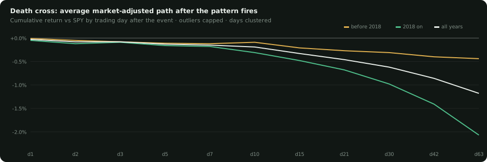
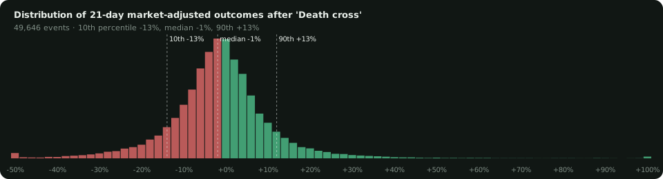
Death cross — 50-day average crosses below the 200-day average that day. Across 8,057 stocks and 1994–2026 it occurred 49,646 times. Measured against the S&P 500 over the next 21 trading days, it returned -0.27% before 2018 and -0.68% since. Verdict: no reliable signal — it failed to hold with statistical significance in both eras.
Versus the average stock
The honest yardstick is the pattern's return minus the baseline for the era, because the average stock itself trailed the index badly after 2018 (-0.94% over 21 days). Relative to that baseline, "Death cross" ran -0.10% before 2018 and +0.29% since.
The spread of outcomes
How the study was built
Every occurrence across 8,057 US stocks and up to 32 years of daily prices — 12,135,054 events across all sixteen formations. Outcomes are market-adjusted (the stock minus SPY over the same days), clipped at -50%/100% so one 10× stock cannot own an average, and days are clustered so 3,000 stocks crashing together count once. Everything is split at 2018: a pattern is only real if it holds in both halves. The full table of all sixteen is free to read.
The interactive study, and the arrows on your charts
Members get the Formations page with every pattern's path and distribution, plus the ThinkorSwim study that plots the five surviving formations on any chart with the measured outcome printed beside each arrow.
Open the Formations pageFree ThinkorSwim indicatorQuestions this post answers
Does the 'Death cross' chart pattern work?
Across 49,646 occurrences since 1994, the market-adjusted return over the next 21 trading days was -0.27% before 2018 and -0.68% since. Verdict: no reliable signal — it failed to hold with statistical significance in both eras.
How is 'Death cross' defined here?
50-day average crosses below the 200-day average that day.
Which chart patterns actually work?
Of sixteen tested, five repeat in both eras — four of them negative (one-day pops, vertical runs, two-sigma band breaks and RSI above 70 all lag the market afterwards) and one positive (a pullback in an uptrend). Three flipped sign after 2018, one faded, and seven — including the golden cross and death cross — are indistinguishable from noise.
Is this a buy or sell signal?
No. These are average tilts of a fraction of a percent with a spread of outcomes many times larger. Historical description, not investment advice.